Final Product – Making Of The Toucan

The pictures above are showing us painting and just finishing up the toucan. I think it turned out quite well, even though it did take us quite a while to make everything.

This is our toucan fully finished. I think it turned out well and we managed to finish it just in time, as we had a slow start. Although, the colours of the beak aren’t  accurate to the reference, it still looks like a toucan.

Record Of Process – Making Of The Toucan

img_0966.jpg

The picture above is of a paper straw structure Steph made at the start of our project. This was so that we could get a good idea on where to start/how to structure the bird.

For the bigger, final version of the bird, Shannon and I had to draw an outline of the toucan from a projected photo, for the group to build from.

From this structure, Robyn and Shannon started to build the beak structure of the bird, as I started to build part of the neck.

As pictured below, Shannon and Robyn tried to start the building process of the body. However, that didn’t go to plan as we couldn’t figure out how to complete it properly.

After some time, we managed to attach the neck of the bird to its beak. This took some time as it was quite difficult attach and we needed to add more support beams.

This is the bird pictured after other team members came in. They managed to build the body and one wing of the bird – which is what Shannon, Robyn and I couldn’t complete. However, we all helped after to place support beams where needed, making sure the toucan was structurally stable and ready for the neck and beak to be attached.

This is where we finally finished the structure so we could start applying tissue paper, prepping for the paint layer. The height of the bird is roughly 6ft from beak to tail. In addition, with the willow branches, we added tape rolls for the eyes of the bird.

This is the toucan fully tissue papered.

Onto the final stage where we started to paint the toucan, we painted the toucan navy blue. We did this as it would add more colour to the, normally, black and white bird.


Evaluation

Townscape

In this first project, I learned a lot of things about properly completing a sketchbook with work. I also learnt about painting with acrylics and the process of buildings up layers (painting over collage), and although I didn’t enjoy townscape as much as the other projects, I still learned quite a bit. I addition, I learnt in textiles how to do a process called ‘Reverse Applique’ which was fun once I got the hang of the sewing machine. Furthermore, in printmaking, I learnt the processes of monoprinting and printing with coloured inks, I liked this more as the process was easier and the outcome was nice.

Within this project I also learnt how to paint in illustrator to create digital versions of the townscape pictures I had taken, also learning how to photoshop my pictures alike David Hockney’s work with layers. This was a fun process.

Figure

I enjoyed this project more as I like drawing portraits and the human, however, my skill in this area isn’t as developed as I’d like it to be so most of my drawings I wasn’t happy with. Although, I feel as though throughout this project, I improved my drawing/painting skills and became more comfortable with acrylics and drawing. I tried exploring different mediums to work with like watercolour, pen, acrylic, sewing etc. and I think I improved whilst learning processes.
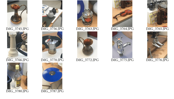
Still Life

In this last project, I managed to move onto a second book as I had produced more work on this project. I enjoyed still life more than I thought I would and I liked experimenting more with things – I tried out painting more with acrylics. With printmaking, we were introduced to Dry Point Plates which we would etch into, tracing your chosen image. With this process, I created a lot of prints, which I enjoyed doing as it was an easy process that had a good outcome, which helped bulk my work.

After printing, I took two of my pieces and sewed into them using the free foot, I liked this process. In addition, in this project I painted two (one unfinished) still life observations, but to improve these I would take into account the background and not just the objects themselves. My favourite work within this project was the Juan Gris inspired drawings we had to complete, I later turned my favourite into mixed media pieces, experimenting with mediums.

Sachin Teng – GIF Research

still life gif research.gif

These animated gifs are created by an artist called Sachin Teng. I chose her work because I really like how she illustrates and turns her work into a moving animation – it gives more life to the piece.

Image result for sachin teng gif

The colour palette that she works with is very pleasing to the eye. In addition, the composition of items in her piece makes it more interesting to watch. I also chose this because the digital illustration part of the gifs is something that interests me.

Narrative in Photography

A narrative is defined as ‘a story or account of events, experiences, or the like, whether true or fictitious.’

Screen Shot 2018-10-31 at 09.58.42

This narrative photograph set is showing time passing, going back in time to when we were created (like in the bible).

Screen Shot 2018-10-31 at 09.59.37

This advert is conveying the message of an eating disorder/anorexia. As seen in the picture the girl is dangerously malnourished, but sees herself as much bigger than she actually is. Thus, making it an advert giving us awareness of what these people deal with/how dangerous the situation is.

Screen Shot 2018-10-31 at 10.00.02

I think the message this advert is trying to convey is how dangerous smoking is and could cause death. In addition, the empty patch of ground that has text ‘no smoking area’ connotes that the non-smokers are better off.

Screen Shot 2018-10-31 at 10.00.14

In the way this picture is set up, it looks more of a comedic advertisement/photograph, as it shows the man knocking the bottle, with his shirt (ironically) looking in shock as it falls.

Screen Shot 2018-10-31 at 09.58.13

I think the story is about the man digging his own grave, maybe symbolising that life meaningless as he stayed in the same spot. In addition, we are responsible for our own lives and what we do so, we can only blame ourselves in the end.

Screen Shot 2018-10-31 at 09.57.18

Screen Shot 2018-10-31 at 09.57.37

1. Establishing scene shot

2. Detail image

3. Portraits

4. Action image

Screen Shot 2018-10-31 at 09.56.00

This picture looks like it shows someone hurting themselves eternally to take the pain of thinking of someone internally, elsewhere.

Free Foot Stitch Piece

In textiles, I used a free foot to stitch into my prints on cloth. I found this method easier as you had more freedom with your stitch and could create various shapes and lines. When I first stitched into the cloth, I stitched over the whole printed bottle. Next time I would leave part of the print and in a different colour, stitch on the ‘shadow’ parts instead.


Tap Prints

IMG_5200

I did another dry point plate with my ‘Juan Gris’ drawings in my book (the taps) and I printed over the one on the right, with one of my dry point bottles. I liked how these turned out, especially the one on the left as the intensity of the ink and detail shows well.

The one on the right could’ve been done a little better as the detail doesn’t show as much (due to smudging/too much ink). Next time I would try different things to print with it as the bottle looks a little out of place. However, I like the contrast of the ink against the black paper as it gives it a ‘glowing’ effect.

Bird Skull Prints

In my book, I sketched some bird skulls and proceeded to transfer them onto a dry point plate, so I could make them into prints. I tried to intensify the ink into the shading/tone in the skulls so it would contrast more with the paper. These are the ones I decided to mount (black ink and green ink) and I am happy with how they turned out – as the ink from these ones printed well.

Still Life Painting

With this painting I used a composition of 3 items that I thought were interesting together. I painted with acrylics, mixing the colours to get similar colours to reality. I started off drawing the shapes with watered down brown acrylic and painted and worked into it from there.

I like how this painting turned out. However, next time I would consider whats in the background more to bring everything together, instead of just painting the items on their own.

Still Life Photographs

For my still life photographs, I tried to take pictures of the objects in different compositions. I used some of these pictures for my illustrations and gif animation.  I tried to pick various objects around the room, I mostly liked drawing/using the taps, kettle as tall bottles as they were interesting to draw.

Screen Shot 2019-02-13 at 11.09.17